UX
|
6 Min Read
Thursday, July 14, 2022

Mobile Scrolling: Horizontal vs Vertical | Which is Better?

Scrolling has been present since ancient times as tons of text of knowledge and wisdom are written and stored in scrolls for future references. Today, we'll be exploring how scrolling came about, and why it is important to learn about user trends to better improve user experiences in the current age.
Scrolling: The Origins
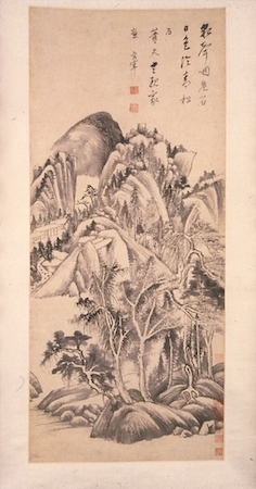
Scrolls came from ancient Egypt, which were utilized in order to record keep important scriptures and text from cultures, and was widely used around the world. Scrolls exist in different forms, primarily as a Vertical hanging scroll, or a Horizontal hand scroll.
Dong Qichang,Landscape, c. 1555-1636,
hanging scroll painting, 95.25 x 42.5 cm, China
© Trustees of the British Museum

Image Source
Zhu Xiuli, Landscape, c. 1985-89,
handscroll, ink and colour on paper, 30.3 cm high, China
© Trustees of the British Museum

Image Source
The scrolls contents primarily consists of important literature, or drawings depicting stories / folklore from cultures. Scrolls were eventually replaced by Codex, which are sheets of papyrus, vellum and materials which were capable of being written on.
Storybook in the making
Codex are later transformed into what we know as the modern book, whereby it uses paper (made from trees), and utilizes printing as oppose to manual handwritten text from the past.
Codex Sinaiticus | 4th Century biblical manuscript

Image Source
Modern day reading norms
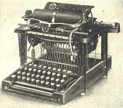
Typewriters also played a part in how humans consume content. As typewriters have a maximum of about 70-80 characters per line (CPL), users will then have to do a Carriage Return (modern day ‘Enter’ on our keyboards) to start a new line of text. This in turn, made the text to be vertically aligned, which then cultivates readers to read from top to bottom in a vertical manner, as what we have seen currently.
World Oldest Typewriter

Image Source
Typewriter Carriage Return

Gif Source
Information mediums
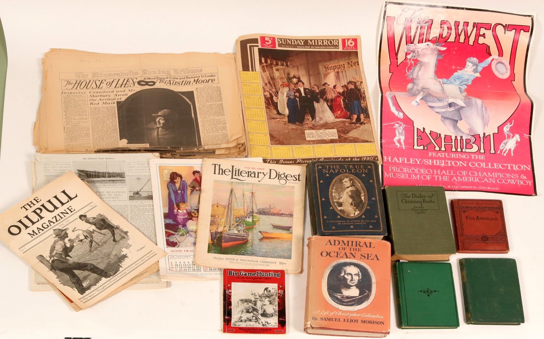
Storybooks, Newspapers, Magazines, Manga were later developed as physical forms, while websites, mobile applications, which take on as digital forms of information, much later on became the trend amongst the world as digital era takes flight.
Magazines, Newspapers, Books from 1920-1940

Image Source
Reading patterns
Scrolls utilized both horizontal and vertical reading pattern, whereas Codex adopts a horizontal reading pattern. This in turn shaped how the population worldwide reads, in which springs up pattern theories of how humans read ( F shaped, Z shaped etc.), which brings to this article’s topic, of which scrolling would be an optimal user experience, horizontal vs vertical.
Focal points between F and Z Pattern

Image Source
Design considerations
Screen Size
So, which would be considered an optimal user experience in the current digital era?

First, we would have to consider the platform that we will be designing for.

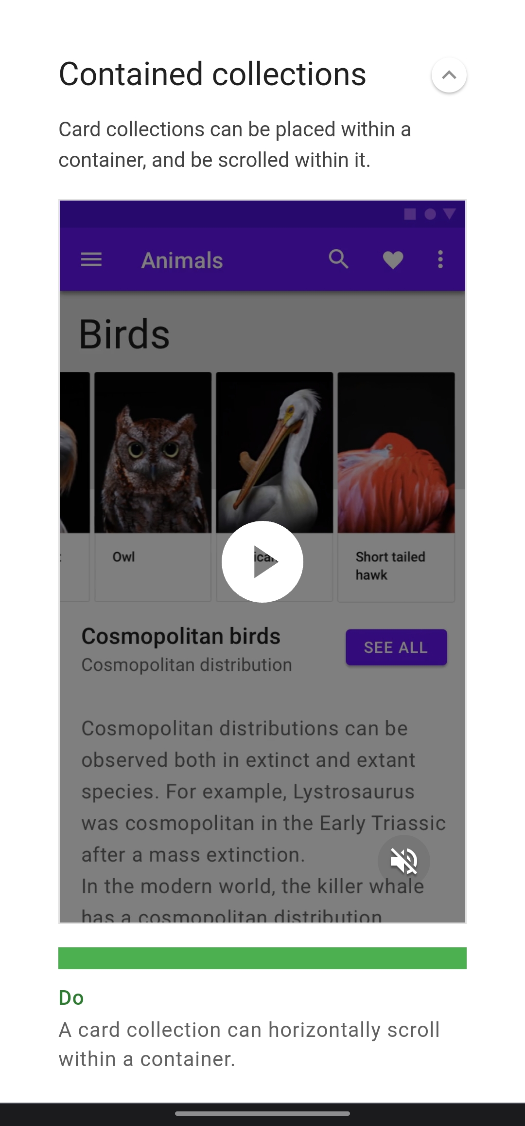
For mobile phones and tablets, it has lengthier vertical dimensions, which makes it ideal for vertical scroll designs (feasible for horizontal scroll designs if the application runs in horizontal mode, such as games, video streaming etc.). However, we do see a trend in a mixture of both horizontal and vertical scroll design incorporated within applications, such as the Netflix app, which consists of sub categories which group the individual shows (design term "cards"), highlighted in blue below. This is called the contained collection, in which it allows users to be made known of that it is horizontally scrollable, by having a portion of the card, highlighted in green below, hidden out of width.
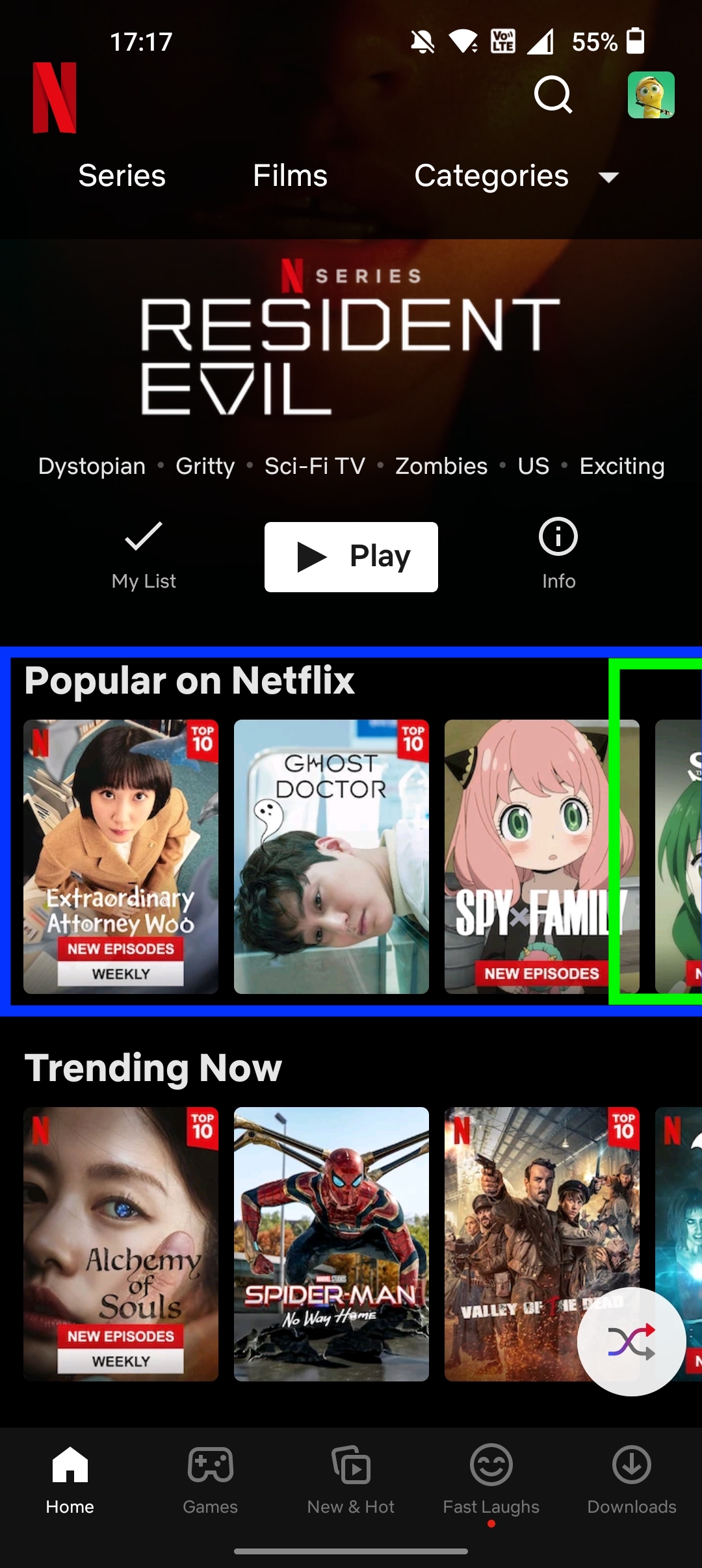
Netflix Mobile App
Google Material.io definition

Image Source
For bigger screen interfaces such as tablets and laptops, it has lengthier horizontal dimensions, which makes it ideal for horizontal scroll designs, however, there would still be a set guideline on the maximum amount of items placed horizontally for scroll, as it would not be a good user experience for the user to be scrolling endlessly for a minute or more to their desired item of interest.

Thus, for all platforms, be it big or small, will have to adhere to a visual hierarchy for a better user experience.
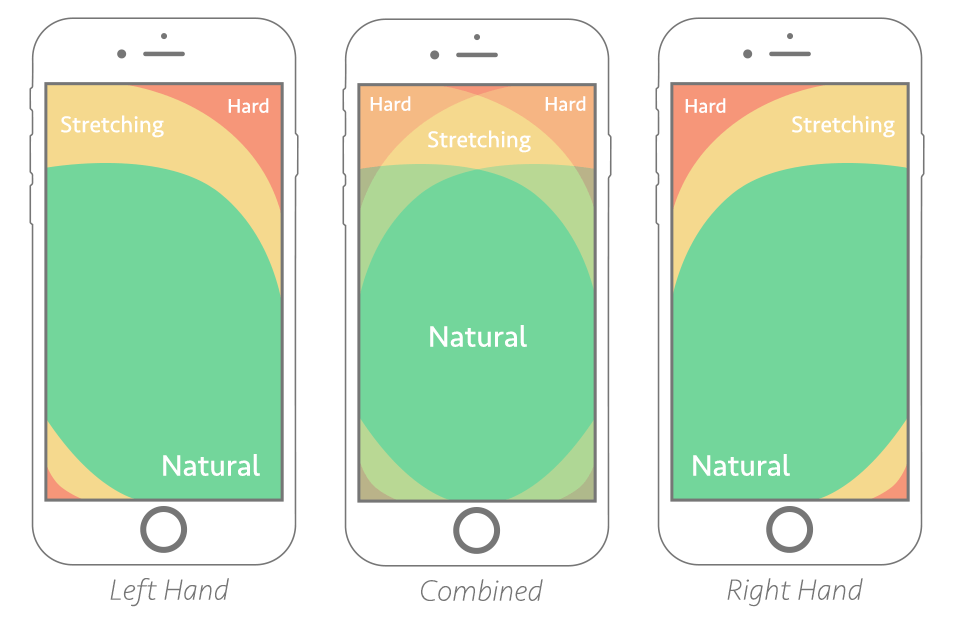
Thumb Zone
Thumb zone mapping for Left, Right handed
Image Source
Based on the diagram, it shows the optimal mappings for thumb interactions on a mobile phone.

It is divided into 3 circumstances:
Thumb interactions, comfort level should be a design consideration that designers must think of when understanding how to optimally improve or create a good user experience. Users should be able to access to functions / buttons with ease, and with minimal instructions or explanation needed.
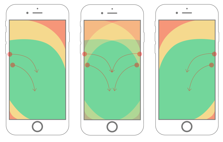
Swipe gestures data collected from user testing
Image Source
It is also easier to achieve smoother thumb movement vertically due to the way how mobile phones are made, and how we hold our mobile phones vertically.

With relevancy and retained knowledge from existing designs of other applications, it will be generally assumed by users that the reading and viewing structure of content would be vertical. Non-drastic, minimal changes to such reading, viewing norms can be challenged, but it should not affect the user’s basic experience of going through content, albeit there would be drop-off rates in the initial phase for users who don’t feel natural, comfortable in using the application.
Visual Hierarchy: Top to Bottom / Left to Right
Statistics
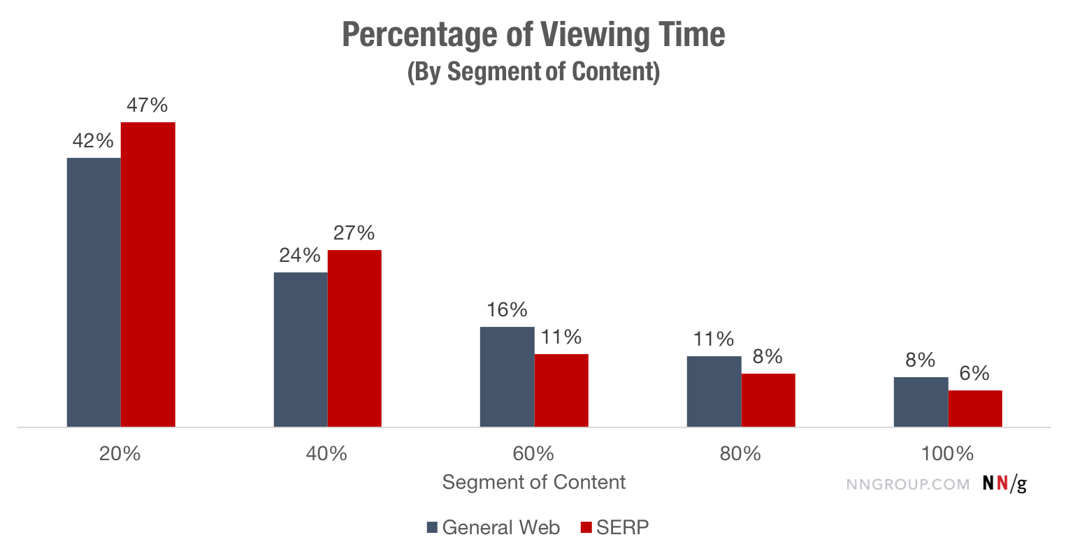
Percentage of time spent on different segments of content
Image Source
Based on Nielsen Norman article on Scrolling and Attention, statistics have shown that the viewing time of contents and information on the topmost impacts and draws users, and the viewing time diminishes as the users scrolls down to access through more contents.

The data gathered also shows that in unorganized content structure pages, users tend to utilize the F shaped reading pattern to scan through the page. Thus, content that are placed directly below the top area of a page will usually garner more user’s interest and attention.
Eye fixation data on a website during user testing
Image Source
Overall, to effectively attract the users attention and capture a longer viewing time, it is important to place content that the website / mobile application hopes to convey effectively to users at the top / near top.
Target Audience
Visual hierarchy in horizontal rule plays a part too as western users tend to read left to right, which allows them to understand the structure and content of what is being provided, and draws user attention.
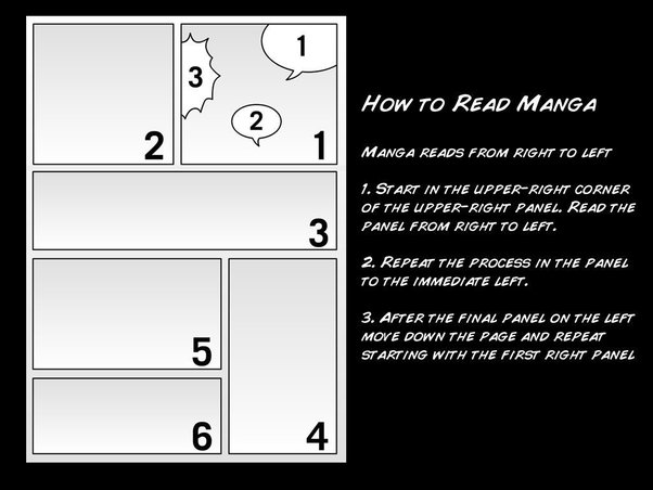
Manga reading instructions
Image Source
There is a difference in reading structure as eastern users might have had the habit of reading right to left due to historic text structures, for example, in Chinese, Japan ancient writings, which also had a spillover effect into the current context of Japan manga.
"Smartphone Finger" Injuries
Due to the increasing time we spend using our mobile phones to browse contents, injuries may result from it, ranging from muscle stiffness to hand injuries.

Some of the symptoms to take note of would be:
When these symptoms arises, use these treatments / remedies to alleviate the pain:
Conclusion
In conclusion, we can see how cultures and history have shaped the way we consume and interact with content, thus, it is important to preserve the usability habits that have been second nature to users (prior knowledge), while not forgetting to add in minor non-disruptive innovative functions to complement with the current trends and practices, which allows users to learn and adapt to the ever changing digital era.